Context and Challenge
Sistema Dela is a real estate developer working with residential and commercial properties. The company's website presents its business, projects, and the brand's visual concept. The project required turning the prepared design mockups into a working responsive interface.
My Role
On this project, I was responsible for the front-end markup of the website. My responsibilities included: - building pages from design mockups; - adapting the interface to different screen sizes; - developing reusable page elements; - implementing interactive interface behavior; - checking visual consistency with the mockups; - fixing rendering issues across browsers and resolutions.
Interface Implementation
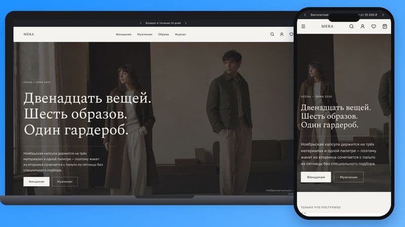
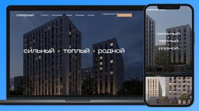
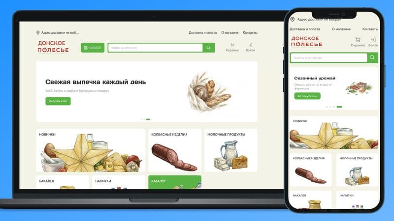
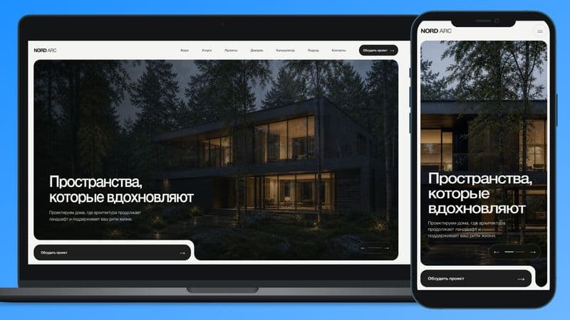
The main goal was to faithfully bring the project's visual system to the browser. For a developer's website, composition, typography, large property images, and whitespace between elements are especially important. I accounted for how blocks behave not only on wide screens but also on tablets and smartphones. The composition of individual sections was adapted so that content and key visual accents are preserved as the screen width shrinks. Repeating elements were built as separate components. This helped keep the interface consistent and made it easier to update related sections of the site.
Responsive Version
I paid special attention to the mobile version. Desktop compositions with large typography and images had to be transformed into a coherent vertical interface without losing visual hierarchy. For different resolutions, I fine-tuned: - heading sizes and line breaks; - placement of images and text blocks; - padding and margins; - navigation elements; - interactive states; - display of long and dynamic content. As a result, the main pages keep a cohesive composition and remain easy to browse on devices of any screen width.
Result
The prepared design mockups were turned into the website's responsive front end. The interface preserves the project's visual style on desktop and mobile devices. The component-based approach keeps pages consistent and allows the site to evolve without a complete rewrite of the existing markup.